Drink coasters worth talking about
Where do you start if you're trying to invent an engaging method to visualise climate change data? Ross Peake reports. This story was originally published by ANU Reporter.
Researchers at ANU considered graphs and pie charts to display climate data, before some lateral thinking threw up the idea of drink coasters.
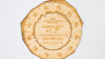
The coasters visualise 12 months of climate data against long-term averages for Australian capital cities.
Each coaster shows two rings representing climate data: the inside ring compares daily temperatures to that location’s long-term average, while the outer ring shows the same visualisation for monthly temperatures.
Sitting on desks, bars or tables, the coasters should prompt discussion and reflection on Australia’s rapidly changing climate.
“They are engaging in a way that traditional graphs just aren’t,” Dr Mitchell Whitelaw from the ANU School of Art and Design says.
They are engaging in a way that traditional graphs just aren’t.
He and Dr Geoff Hinchcliffe specialise in creating objects that provide a tangible representation of data.
They collaborated with the ANU Climate Change Institute to create a small tangible visualisation for the Institute’s 2018 Climate Update event.
The coasters were so popular the researchers decided to build a website showing the same visualisation for more than 100 different locations around the country.
“Graphs can be static and hard to read, but having these visualisations live and online allows people to have a play around with them,” Whitelaw says.
“I hope in particular that schools can use this website to discuss climate change and build data literacy.”
Of the 112 locations shown on the Climate Coaster website, Charleville in south-west Queensland and Miles in the Western Downs region had the highest temperatures in 2017 compared to long-term averages – an increase of 2.6 degrees.
Of the capital cities, Canberra came out top with 2017 temperatures 1.7 degrees above the city’s long-term average. Brisbane’s monthly maximum temperatures exceeded the long-term average for eight months of the year.
Halls Creek in the East Kimberly region of Western Australia was the only location that did not experience any temperature increase in 2017.
What was the reaction when the coasters were unveiled at the climate update event?
“Everyone at the event was captivated,” Hinchcliffe says. “People were handling them, smelling them, asking about them, and everyone wanted more copies.
“So this online version is an opportunity for people to have a look through the visualisations for themselves.”
Visitors to the site can download coaster images for print and social media sharing or for laser cutting their own coasters.The researchers have also made bracelets representing 12 months of Canberra weather data, in the belief that tangible visualisations of data are a powerful way of helping people understand complex topics.
It makes the data much more real.
Dr Rebecca Colvin, knowledge exchange specialist at the Climate Change Institute, says the coasters are a conversation starter that help communicate climate data in a meaningful way.
“I think it is fantastic to have something so tangible – it makes the data much more real,” she says.
Dr Steven Crimp, a climate applications scientist at the Institute, says his role was to extract data from the Bureau of Meteorology archive.
“I worked very closely with the visualisation team to settle on a design that we thought would be accessible to the broader community,” he says.
“It’s important because it provides context for people. Without that context, it’s just a time series or a graph of numbers which really doesn’t have much connection to their day-to-day lives.
“But when you develop a visualisation that has that context, it is much more poignant in its meaning and effect on the way people see their environment, and then they see the value of the data.”


